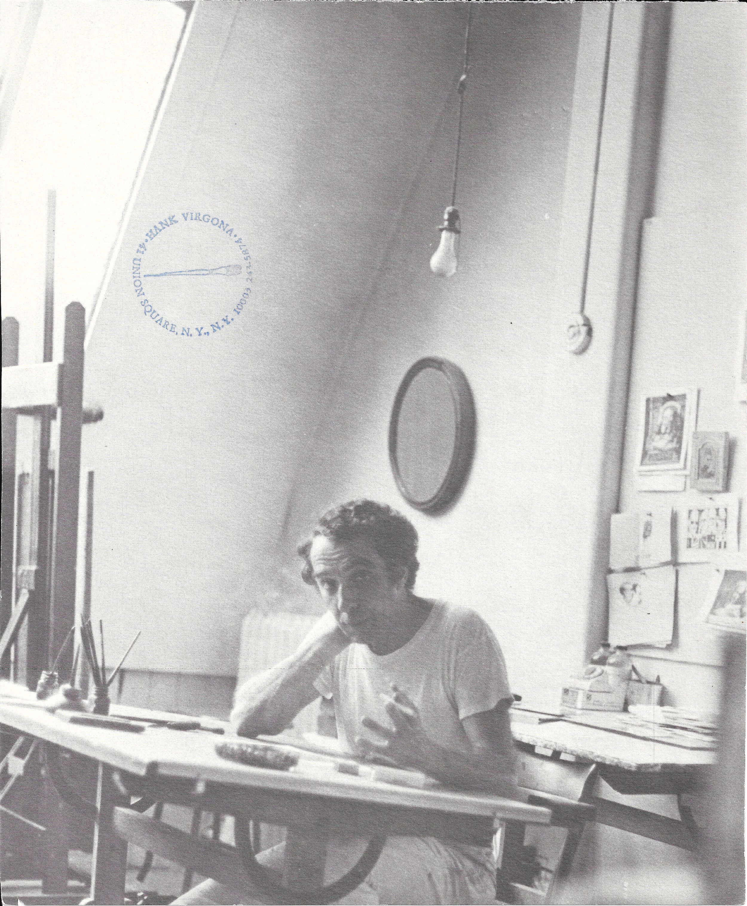
When I moved into 41 Union Square West thirteen years ago and started my interior design business I met an artist named Hank Virgona that has inspired me ever since. At eighty four years young and still painting daily next door to my office, he astounds me with the amount of drawing and creativity that comes from his hands. Focusing now mostly on still life and some portraiture, Hank is a force to be reckoned with whilst constantly taping beautiful sketches at holidays on my door or quietly documenting my daily attire as well as any of the other tenants on the 11th floor of our light-filled building. Known for it’s north facing studios with angled skylights framed in metal, the building has long been a favorite of artists, photographers, architects and designers and I feel lucky to have discovered the building and made it my atelier and to have Hank as my neighbor.
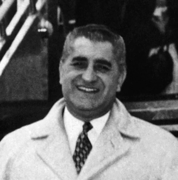
Hank Virgona was born in 1929 to Sicilian parents in Brooklyn on the eve of the Great Depression. Early on in his career, Virgona chose photography instead of painting and remained a professional photographer throughout his service in the army which ended in 1952. In the beginning of his artistic career he chose illustration and had many works in Fortune, Harpers, Argosy as well as the New York Times and received the Gold Medal from the Society of Illustrators among many other accolades.

Hank Virgona working in his light-filled studio at union square west

Multiple works by the artist displayed above his daybed

A closer look at some of the works

A watercolor of several buildings looking north from Virgona’s skylight
In 1999 Adam Shanker filmed a thirty minute video ‘The Art of Hank Virgona: Bottles Boxes & Notes From the Underground‘ interviewing art critics, artists and celebrities that admired and collected his work. Virgona described growing up in Bushwick, Brooklyn and sitting on the stoop of his childhood home with the sun beating down on him and looking at the 150 coats of paint on the door and how all of those layers coming through really began to inspire the way he sees color and line. Both his figurative studies and satirical work capture character in the simplest gesture of sharp or blurred line bringing the person or object to life.
He does the same with his still life’s giving character to things as mundane as a collection of bottles or a paper bag and elevates them to another level. There is no set formula to his work but it is always filled with personality. Hank cites Degas, Goya, Picasso and Giorgio Morandias influences but one quote by Joaquin Torres Garcia he says sums up how he views art and his work best. “Art is not manufactured, it comes from the understanding of a profound harmony, and from living in accordance with it”.


A more colorful mixed media collage work

An etching of bottles in my collection that was a gift from Virgona several years ago
When I approached Hank about writing a post on his career and work he initially asked “what is a blog”? I explained to him that I would be writing an online journal about his life and work and sharing images he would like to share with me to try and gain a new audience for him. He was intrigued since he does not have access to a computer in his studio and is entirely engaged in painting, etching, engraving and creating more work daily than I or any of my colleagues do on average.
He then asked why is it called “The Gilded Owl”? I showed him a picture of the owl that I owned and that I had collected owls over many years and hence the namesake of my blog. I then gave him a picture of the gilded owl which is a real barn owl that has been gold gilded and a few days later Hank gave me twenty four different owls that he had drawn and painted on a variety of colored paper. Following are some of the fantastic drawings and the envelope that accompanied them.

Special delivery from Hank Virgona with personalized postage for the gilded owl

Four owls by Hank Virgona
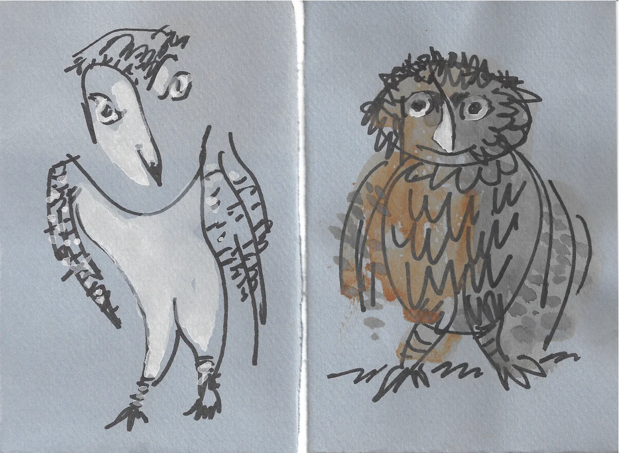
A couple more on blue grey paper
Virgona’s work is in The Metropolitan Museum of Art, The Museum of the City of New York, The New York City Public Library, The Smithsonian and over twenty more important permanent collections and he has had over two dozen one-man gallery shows. The awards Hank has received over the years are too many to mention but highly esteemed and respected. I am honored to know this remarkable artist whose eye for detail has taught me to look at the world a little more thoughtfully.

Etched name plate on Virgonas’ studio door
Following are links and further video on the work of Hank Virgona.
video link below by Andrew French