ART

DON FREEMAN / MY FAMILIAR DREAM by Andy Goldsborough

DF-01.jpg

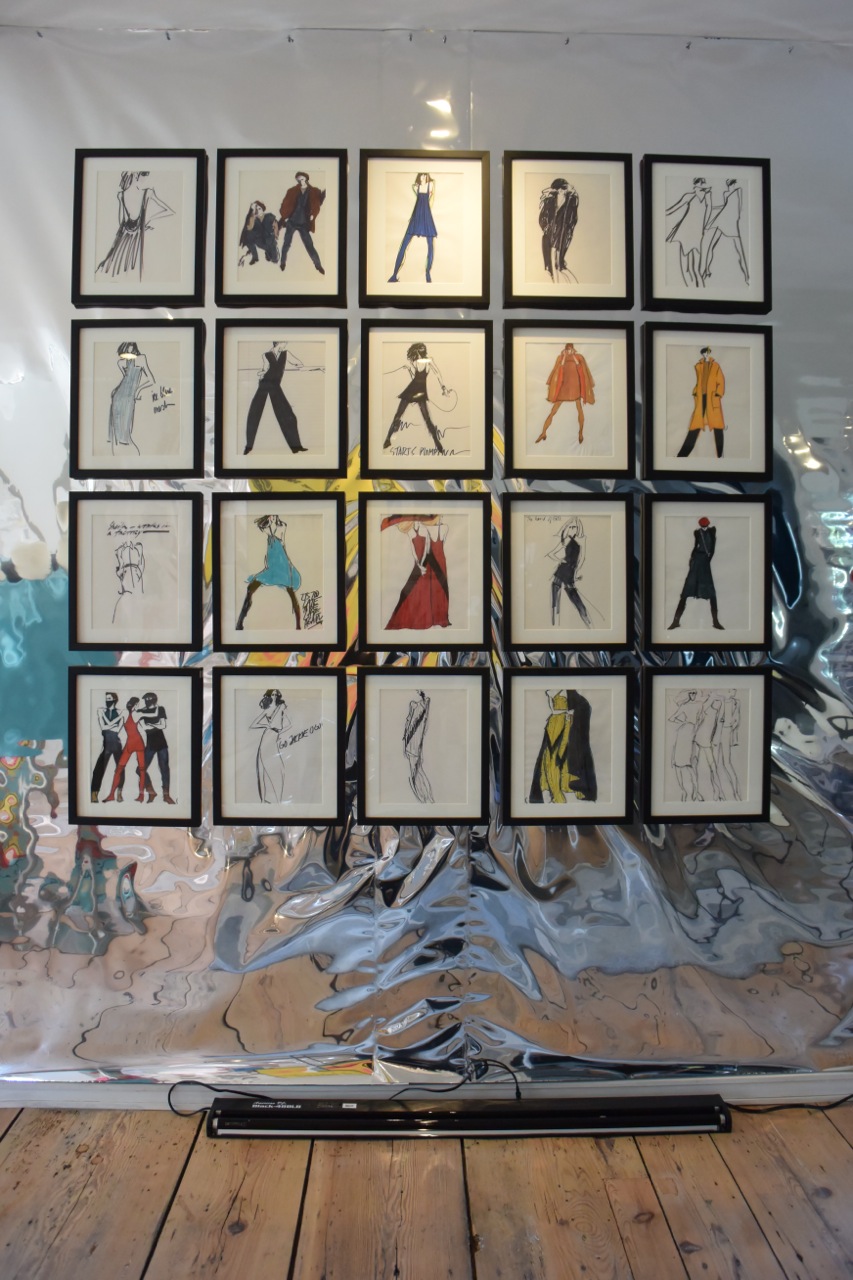
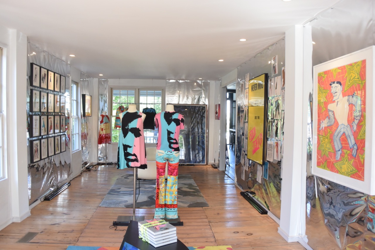
The Gilded Owl is pleased to present DON FREEMAN / My Familiar Dream / 1994-2108.

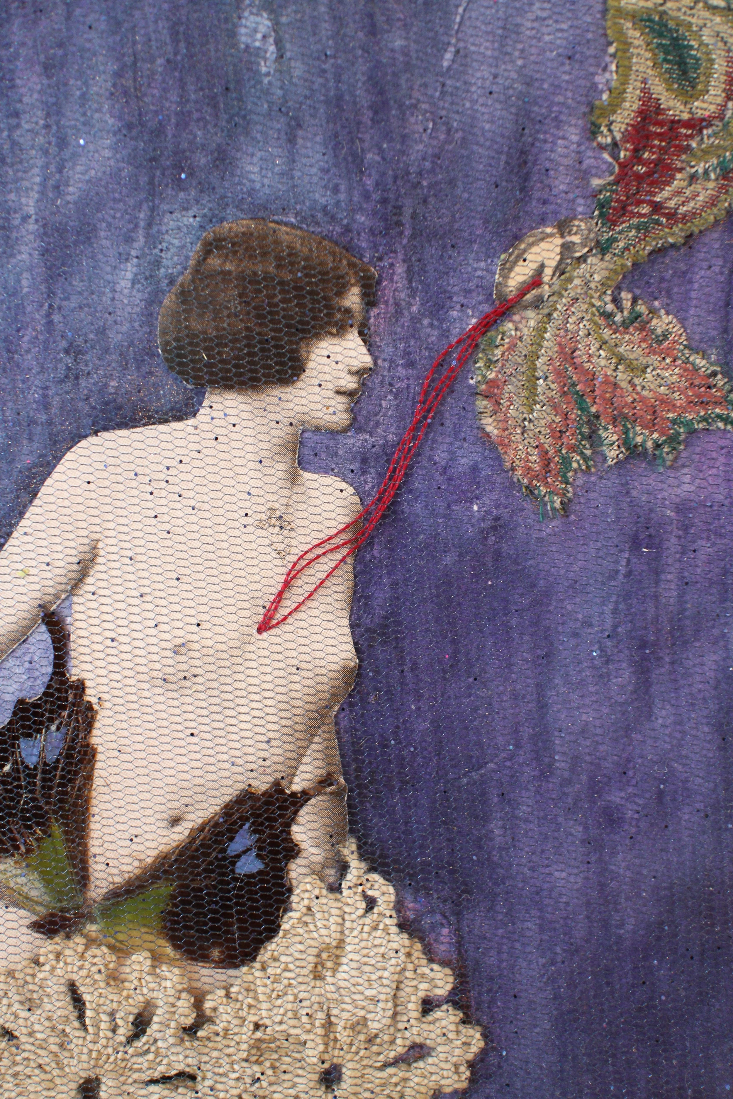
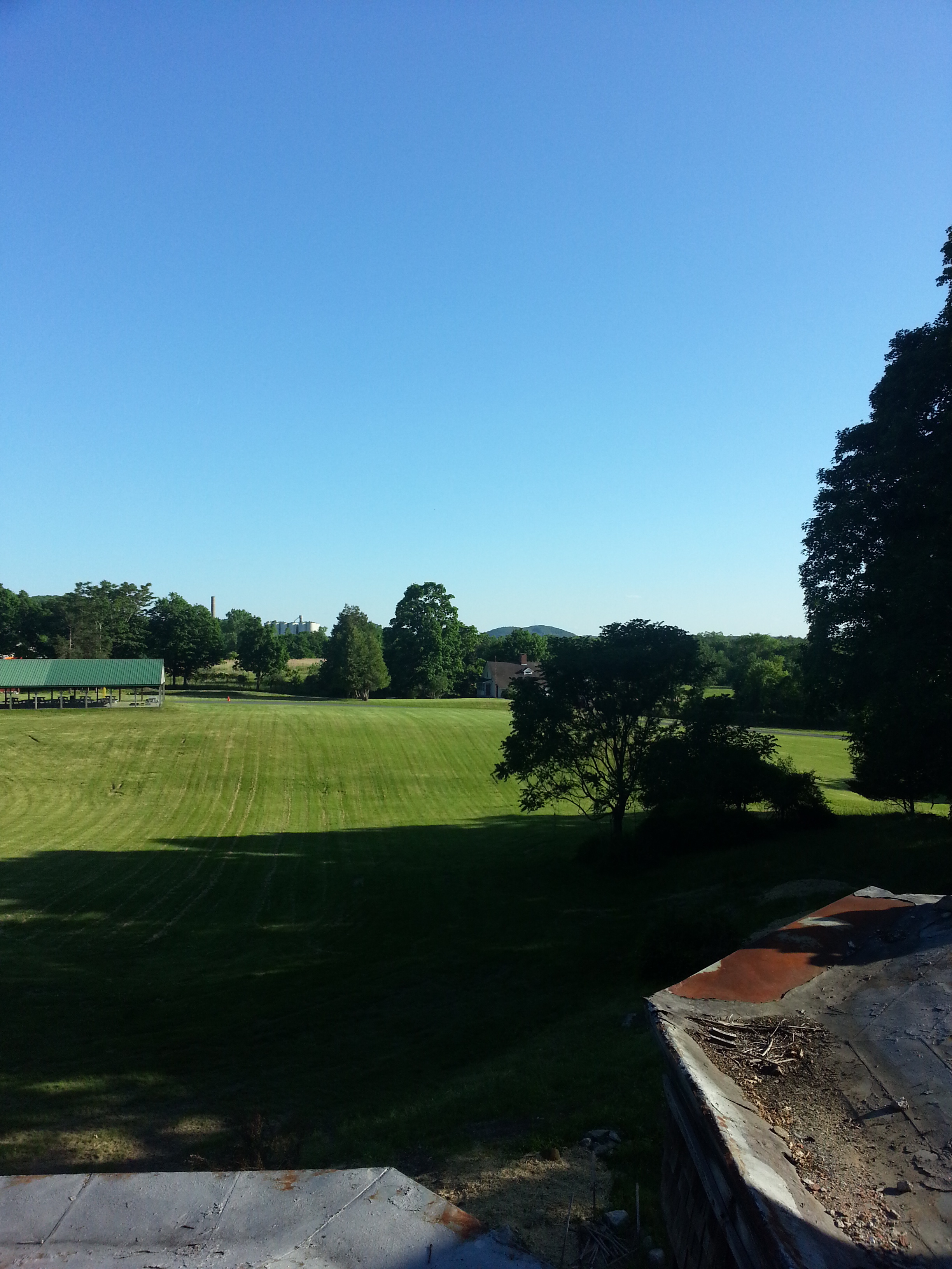
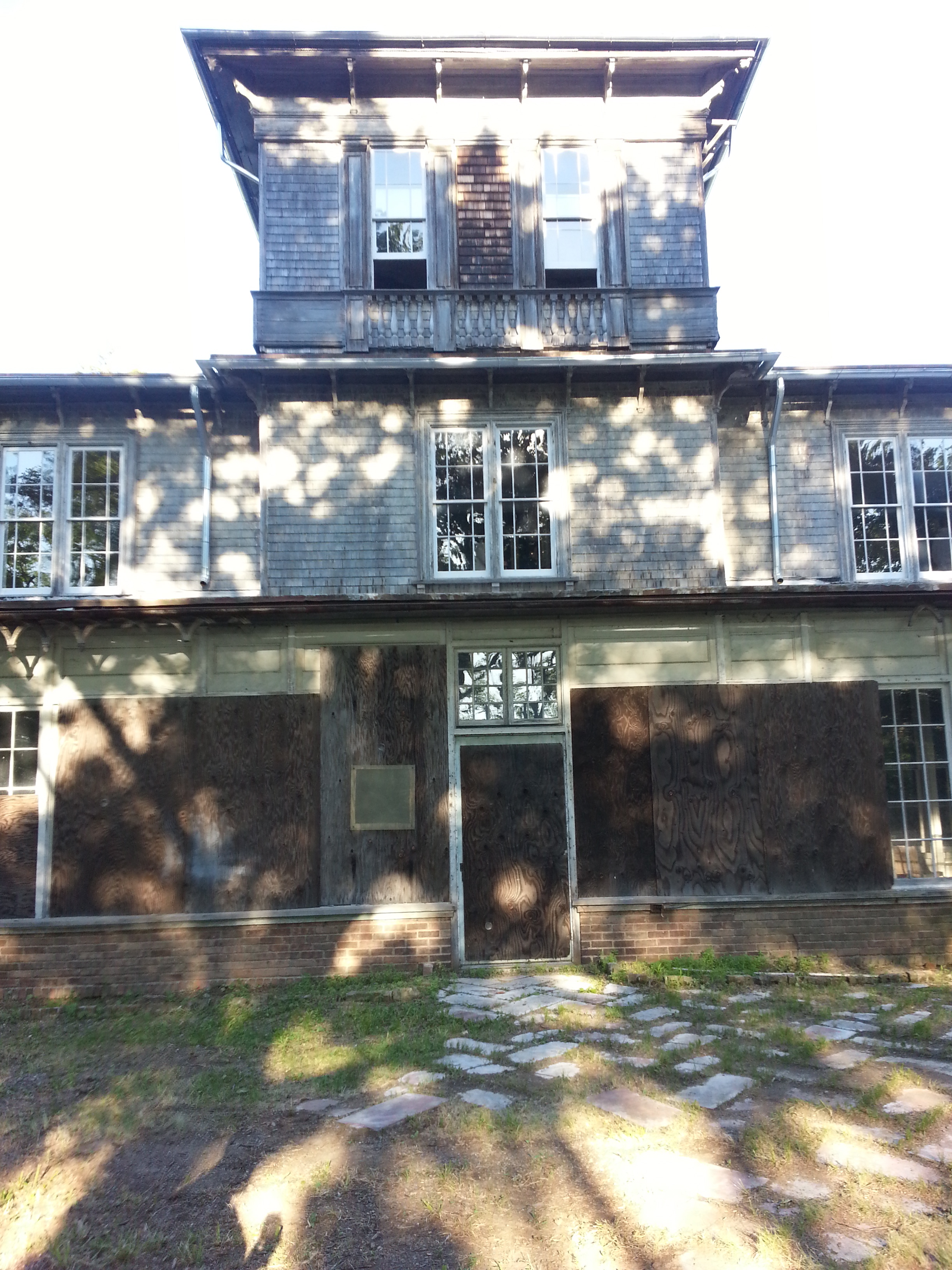
Don Freeman is an American photographer, best known for his large, monochrome prints that depict subject matter, be it landscape, human forms or architectural fragments, in states of transmogrification. He divides his time between New York City and a house in the Catskill Mountains that he shares with his partner Garo Sparo and his dog Louie.

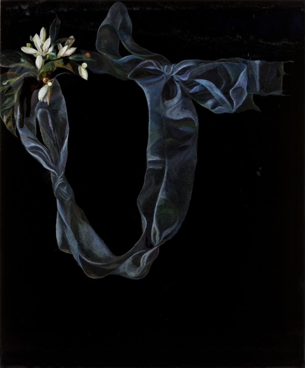
In the early years, Don mined religious iconography and images of classical antiquity to produce his hybrids of painting and photography. It was during this time that Don discovered photographic print toning and abandoned painting completely and started working with only his camera and his toning chemicals, creating work that explored tonality, depicted blurred and often fragmented images. The toners that Don chose to work with were single color, dye based, manufactured by Edwal. Dye toning kits were the domain of the amateur photographer who wanted to evoke a mood and nostalgia. In Don’s hands, these kitsch materials were transformed into a highly nuanced color system. The resulting image is no longer a traditional black and white photograph as the toning bath creates a chemical reaction that transforms the metallic silver in the paper to a dye.

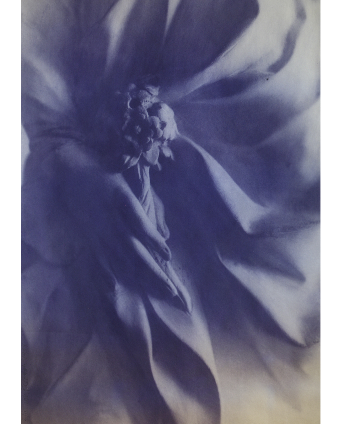
Over the years Don pushed the envelope on what a photograph could be, he next moved on to using architectural blue printing to create a series of highly nuanced prints of flowers and Greek and Roman antiquities. As the blueprint process is highly unstable, something that Don was aware of, the images would degrade when exposed to light, creating ghosts of the original images.  Then he thought about how to preserve them-the “race to stop the process of aging”. He talked to a conservationist at the National Gallery in Washington and got some tips on how they were protecting Robert Rauschenberg’s “Blueprints”. “If its beautiful, people will find a way to keep it around ” she said.  Don’s blueprints were first exhibited at The Elga Wimmer gallery in New York in 1994, and will be on view at The Gilded Owl.

BLUEPRINT-angel.jpg
INSTAGRAM-bluehand.jpg

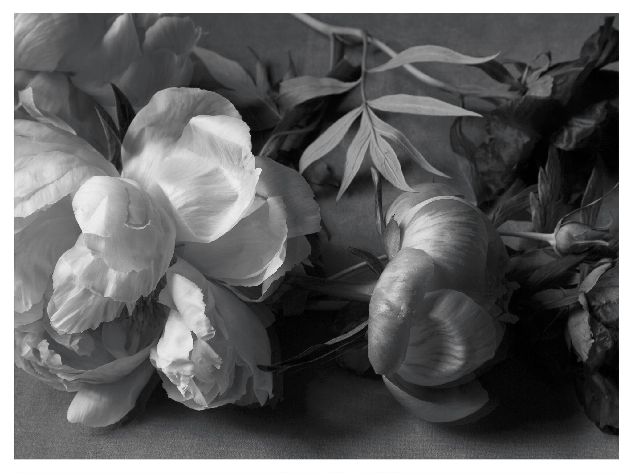
Don’s work is shot on 35mm black and white negative film. He uses high-speed, Tri-X, film for its inherent graininess. Don has created a catalog of images over the years; photos of flowers, antiquities, letters and architectural details that function as his noumenon awaiting their transformation by Don into subjective, tangible images. Don refers to his collection of images as, “a sort of Noah’s Ark.” Being very influenced by cinema, specifically the films of Andrei Tarkovsky, and more specifically Tarkovsky’s film Mirror, in which Tarkovsky creates a visual narrative that combines past and present, dreams and reality, color and black-and-white; themes at the core of Don’s interests.

His hand-made book “My Familiar Dream” (1991) a collection of images that include his ghostly series “Pompeii, and Alabaster Vessels, “I am all you have to contain your fears” reflect his belief that there is a collective unconsciousness to all things, and his camera a tool to bring that out.

The Branches: “My branch series is an ongoing project. I like the idea of coming face to face with something beautiful without anything coming between the image and me. I often carry around a white card with me when I go on walks through the woods and use it as a background to isolate the branches I find, like a portable studio. I’m not going after a Blossfeldt type approach, they’re very graphic and probably reflect my formal training as a graphic designer. When I exhibit them they’re presented like a checkerboard, one black, one white, after the other, across the wall.”

Elco_2018_Branch3_24X30_1-copy.jpg
Elco_2018_Branch4_24X30_1-copy.jpg

The Curtains: “They’re from a confessional in a church in Arezzo. I was taken in by the minute, human detail; you can actually see that they were stitched by hand. I think they express ideas that are deeper than words.”

curtain.35.5X50-copy-1250x888.jpg

When I shoot portraits I often like to make people look like statues. None of my work is photo shopped. I shot my friend Katherine under a tree and the sunlight filtering through the leaves created this dappled effect and made her take on the appearance of a weathered statue – the idea of turning someone into marble. It’s based on my favorite myth, Pygmalion, only in reverse. My lighting experiments don’t always work – I often need to see the contact sheet to see if a succeeded, but this one certainly did.”

FA_KATHERINE.jpg

Don’s latest work in process “Stone Faces” are digitally manipulated photographs from his archives of black and white negative film. “I want to create a library of images, using my original negatives in a modern digital way. Recently I had all of my Super8 Black and White film digitized from a project I began 30 years ago in Paris, which is loosely based on “Nadja” by Andre Breton. Last year I returned to Paris with my Super8 camera and together, with we finished the film, finding just the right ending-30 years later. All it takes is time.”

stonefaces_postcard_763.jpg
stonefaces_postcard_710-1.jpg

The Gilded Owl will also be screening Don’s documentary “Art House” (2015). The film explores the handmade homes created and lived in by eleven distinguished American artists, including Frederic Church, Paolo Soleri, George Nakashia and Wharton Esherick.

For further information contact andy@thegildedowl.com and elizabeth@thegildedowl.com

PAUL JACOBSEN IN THROUGH THE OUTSIDE AND BERLIN DEKO by Andy Goldsborough

We opened our current show Paul Jacobsen “In Through the Outside” and Berlin Deko, a collection of furniture, lighting and objects by German architects from 1910 to 1930 this week with a stellar turnout and the installation will be on view through November 18th in our 105 Warren Street gallery.

All of the works ( 5 oils and 2 large scale charcoals ) evoke a sense of the life Paul has made here in the Hudson Valley. Initially, the drawings appear to be straight forward renditions of the wild weeds that envelope the artist’s studio and the acreage surrounding his home. But on closer observation, we notice that Jacobsen has imbued a gorgeous elegance and given a quiet stillness to the lucky ones chosen as subjects.  By separating these particular specimens  from the rest of the knotted weed sprawl which has a grand presence on Paul and Laura’s land, we are given the opportunity to stop, be still and notice every detail that the Milkweed, Nettles and Sumac have to offer. Strength and delicacy coexist within the drawings reminding the observer of the many mysteries, struggles and unexpected wonders that the land in Germantown constantly reveals.

Each of the 5 oils  produced specially for this exhibition tells a different story and reflect the ongoing ideas and observations Jacobsen has grappled with while living on the land and incorporating into his work. UNTITLED LANDSCAPE, 2017 and UNTITLED CRYSTAL, 2017 are perhaps most closely associated with the charcoal drawings because of the predominate use of black and white but whereas the artist gives an expansive amount of freedom to the wandering weeds, Jacobsen cleverly traps the viewer into his exact  perspective and mathematically precise observations of the land, it’s distance from us and, at the same moment, by adding elements of the real world ( dangling crystals, portraits, flags, everyday kitchen items and tools ) the artist reminds us that the land actually supports our physical existence.  All of this beauty is seen through the pin point precision of a lens and is encapsulated within the artist’s hand painted frames.

The-Whitenness-of-the-Whale.jpeg

William Morris and Herman Melville serve as intriguing subject matter for Jacobsen. Both of these iconic figures represent the artist’s continued fascination with historic men and their relationships with their respective crafts. Morris was and English textile designer, artist and writer and is most closely associated with the English Arts and Crafts Movement. A close friend of Morris and his wife, Jane Burden, Phillip Webb the architect designed, for the couple, a house in the rural countryside which Morris wanted to be “Modern” but would portray a spirit of the Medieval which is exactly what Webb delivered. Their new habitat was named Red House and Morris spent 2 years decorating the place with the help of artist friends. The rug which Paul Jacobsen designed and was crafted by Equator Production is, in a sense, an homage to William Morris and to his illustrious patterns which were most popular in the wallpapers and textiles he continued to design throughout Morris’s life. The small portrait UNTITLED, WILLIAM MORRIS is an example of Jacobsen’s painterly use of bright colors and juxtapositioning of the figure seen up close, dangling from a thread and push pin and the lush landscape which supports the figure and creates a tension between the foreground and background. Illusion is hard at work here as is the precise technique the artist is so adept at which ultimately pulls the viewer in.

William-Morris-oilo-on-panel.jpg

Jacobsen’s UNTITLED (PORTRAIT OF HERMAN MELVILLE) is directly related to chapter 42, the Whiteness of the Whale where Melville describes the voids and curiosities of the universe through the metaphor of the White Whale. In essence whiteness is not so much a color but the visible absence of color. In the artist’s portrait of Melville, Jacobsen incorporates symbols, American Flags, an architect’s compass, a golden crystal which upon close study reveals a small but pure white triangle, all of this painted against a vast, horizontal ocean which harbors the White Whale and provided a way for Melville to set sail on his 3 year journey at sea. The artist, Jacobsen,  has intentionally left images of the whale out of the painting and focuses on the author himself, his symbols and the white triangle containing all of the colors of the universe resting a top the crystal . This is an important portrait in context of the exhibition since Melville was a visitor to Hudson and in Moby Dick he uses imagery of the whale to describe man’s relationship to nature in terms drawn from 18th Century Aesthetic Philosophy which Jacobsen also  beautifully threads throughout his work.

The-Whitenness-of-the-Whale.jpeg

UNTITLED ( COOPERS HAWK ) is perhaps the most direct  portrait in the exhibition, a life study of the bird Jacobsen found on his land in Germantown, it’s twisted body still warm from the fall that took place after he flew into a pane of glass and died. Feathers, greenish talons, a tiny black beak and a regal display of soft , gently patterned black and white feathers all became the perfect subject matter for the artist. After taking the hawk to his studio, Jacobsen rearranged it’s body delicately and then respectfully placed it into a wooden box, photographed the body before any signs of rigamortis set in, preserving the beauty and dignity of death. The portrait is gorgeous, reminiscent of and Old Master work painted with the hand of brilliance.

The Gilded Owl and Lampedo Gallery presents an exhibition devoted exclusively to furniture designed by Berlin architects between 1910 and 1930. The six-week show, “Berlin Deko – German furniture 1910 – 1930″ is a comprehensive survey of German design to look beyond the Bauhaus movement. It aims to highlight the long-overlooked significance and legacy of Berlin as an important European center of architecture and design. Among the protagonists are Leo Nachtlicht, Bruno Paul, Eduard Pfeiffer and Lajos Kozma.

DSC_4238.jpg
22281680_10154969820470318_5343909586258917561_n.jpg

Because Berlin has attracted artists from abroad for centuries, the city has also been a crossroads for a variety of approaches to art and design that originated in near and far corners of the world. These distinct influences and their many hybrids will unfold throughout the exhibition. The objects shown will span a vast arc from futurism to expressionism, from the avant-garde to the traditional, with an underlying current of the exotic and the baroque, which is typical of the period.

Over the past twenty years German interior design from this period has often been reexamined and found its way into private and public collections such as those of the Kunstgewerbemuseum Berlin, the Wolfsonian in Miami, or the Metropolitan Museum of Art in New York. To capture the truest essence of Berlin in the Deco Years, Lampedo invited Arne Sildatke to write an essay for the show. Mr. Sildatke, who wrote his doctorate paper on Art Deco Interiors in Weimar Germany, is a key expert who reevaluated German design of that era and gave it a new position in the history of art.

DSC_4240.jpg

Established in 2004 in Berlin, Lampedo Gallery is focused on European continental furniture. In 2009 it relocated to New York. Owner Markus Winter has introduced furniture by architects such as Karl Friedrich Schinkel, Ludwig Mies van der Rohe, Bruno Paul or Gio Ponti into both public and private collections. In 2004 he curated, along with Brian Kish, the first exhibition in America on Guglielmo Ulrich and in 2008 he organized the first exhibition on Luisa and Ico Parisi in Germany.

Paul Jacobsen “In Through the Outside” and Berlin Deko will be on view at 105 Warren Street through November 18th.

GEORGE HOFFMAN FRAGMENTS / DUCCIO . HOURS . BREVIARY by Andy Goldsborough

George-Hofmann-Hours-1-2012-acrylic-on-birch-board-30-x-24-in. (1).jpg

The Gilded Owl is pleased to present it’s fifth exhibition titled FRAGMENTS; paintings on panel by the artist, George Hofmann. On view in the galleries are 3 bodies of work dating from 2011 & 2012, each of which refer to their respective titles including Duccio, Breviary & Hours. Following are selected works and insight from Hofmann.

DSC_3651.jpeg
Hours 4 2012 acrylic on birch board, 30″ x 24

Hours 4 2012 acrylic on birch board, 30″ x 24

“Like most artists, I look to the past – to see how it was done, for inspiration, and for guidance.
Increasingly, in recent years I have looked to the early Renaissance – probably kicked back further than I was looking before by the acquisition of the Duccio Madonna by the Metropolitan Museum some years ago. This simple tiny picture of the Madonna and Child – of which there are many – especially struck home because of the tiny gesture of the child’s raising its finger – a simple gesture, yet a departure, in expression, and a most moving one. How very much feeling there is in Duccio! Even the simplest compositions, like the depiction of Jesus and the fisherman in the National Gallery in Washington, are full of simple, and honest, emotion.
This is belief, and it is found, similarly, in the Books of Hours and Breviaries of the Middle Ages, in the simple color plates of adorations and other depictions in these Psalters, made by humble artists, and meant for clergy and lay alike – so honest, so simple…
Was there another time when such feeling triumphed in art? 

George-Hofmann-Hours-5-2012-acrylic-on-birch-board-30-x-24-in..jpg

I think the Annunciations, in particular, found their way, compositionally, into my work: this why there is duality in many of my pictures, a right and left side. In thinking about it, it struck me that the improbable meeting of the Heavenly and the Human must have seemed to the artists of the time something so inexplicable as to be almost undepictable. And yet, they tried, in their way, to show these otherworldly creatures coming to the awestruck woman (can we even imagine such an encounter?) who is, for the most part, dumbstruck.
I love the Greeks, and all times, in art, where the form, in its highest development and true feeling merge into one. But in an overly mechanistic and technological age, it seems right to be drawn to those periods in art richest in feeling. And all that I have learned in life about human emotion seems to me to be the richest source, now, for us, in art.”

Duccio fragment 3, 2011 acrylic on board 30″ x 24″

Duccio fragment 3, 2011 acrylic on board 30″ x 24″

“This is painting of emotional life – endless, fluid, recurring.
Gradually we become aware of ourselves in life – our experiences run deep, and are not without trial. Eventually awareness dawns – then it is a matter of sorting out. This painting is somewhat of a record of that.
Initially, Abstract Expressionism was a record of primality of emotion. It has to be remembered that many of those artists were born before electric light.
I am exaggerating, but think how, in their lifetimes the life of the psyche raised its profile in the modern world! Freud was only influential in a big way in the post WW2 years, and that was in my own childhood. The real examination of the psyche has been going on almost secretly since then, now discredited, now elevated, but largely unacknowledged.
But the emotionality of life has been showing up more and more in the work of younger artists, and breaking through in older artists.
I try to strip away, as in therapy, all that is extraneous, to lay bare the essential, and maybe, with luck, the beautiful.”

Codex minor 4 2016, acrylic on maple board 30″ x 24″

Codex minor 4 2016, acrylic on maple board 30″ x 24″

George Hofmann FRAGMENTS will remain open through September at THE GILDED OWL 105 Warren Street Hudson, NY.  For a complete list of works and PDF please email andy@thegildedowl.com

www.georgehofmann.com

THE MYSTERY OF BEAUTY “IL MISTERO DELLA BELLEZZA / WORKS BY INDIA EVANS & ROOMS INSPIRED BY CARLO MOLLINO by Andy Goldsborough

IMG_6981.jpg

On February 27th THE GILDED OWL opened it’s fourth show The Mystery of Beauty “Il Mistero della Bellezza” in Hudson, New York.  Inspiration for the show comes from the inspired architecture and interiors of Italian architect Carlo Mollino intertwined with the expressive feminine collages by India Evans.
Carlo Mollino was born in Turin and created surrealist interiors which manipulated space in extraordinary ways. His use of materials, luxurious and sensual especially in his final home on the River Po served as a backdrop for the mysterious polaroids he took of dancers and other women. Alongside his organic furniture pieces and carefully placed accessories, costumes and wigs his photographs in his final residence are still collected today and his furniture pieces are setting record prices at auction.

Collage artist India Evans uses objects as a vocabulary of feelings and her work explores intuitively various stages of feminine awareness. Through the recycling and juxtaposition of various objects (forgotten, discarded and seemingly worthless), she attempts a transformation towards a precious recollection. Resurrecting memories, collective yet intimate, visceral yet tender……piecing together beauty as if telling a story.

India Evans “The Night Bird” 2103, 11 1/2″ x 9 1/2″

India Evans “The Night Bird” 2103, 11 1/2″ x 9 1/2″

“I am inviting the viewer to explore their childhood innocence and fantasies through their adult nostalgia and sensuality. I hope to create a romantic and playful portrait of the female identity with the possibility of entering dreams: my own or someone else’s, as when a child plays dress up….full of the yearnings for beauty and mystery.”

In rooms inspired by Carlo Mollino’s work and India Evans’ haunting collage works we invite you to experience The Mystery of Beauty “Il Mistero della Bellezza”.
Opening Saturday February 27th 6:00-8:00 pm at 105 Warren Street Hudson, NY

For further information, full PDF of all 34 works or press inquiries please contact

andy@thegildedowl.com
elizabeth@thegildedowl.com

India Evans “Reflected Time” 2009, 7 1/2″ x 5″

India Evans “Reflected Time” 2009, 7 1/2″ x 5″

BLACK WHITE + ALEX P WHITE by Andy Goldsborough

TheGildedOwl_17.jpg

THE GILDED OWL is pleased to present it’s third exhibition in Hudson, New York titled BLACK / WHITE + ALEX P WHITE. Inspiration for the show comes from combining Alex P White’s design sensibility and our love of all things black & white.

A diverse grouping of images including works by VALIE EXPORT, Marina Abromovic, Sol Lewitt, Peter Blume, Sharon Brant, Klemens Gasser, Kahn & Selsnick, Jack Roth and Paul Jacobsen are uniquely paired with sculpture and objects created by Courtney Smith, Bill Stone, Cameron Shaw, Eric Fertman and Valerie Hammond. Furnishings and lighting designed by Alex P White are shown along with these works marrying the idea behind THE GILDED OWL’S vision which is to include the combination of art and furniture in a living environment focused on craftmanship.

Clockwise from bottom, works by Valerie Hammond, Courtney Smith, Paul Jacobsen, Cameron Shaw, Cameron Shaw, Johannes Dorflinger, Eric Fertman, Sol Lewitt and Al Held

Clockwise from bottom, works by Valerie Hammond, Courtney Smith, Paul Jacobsen, Cameron Shaw, Cameron Shaw, Johannes Dorflinger, Eric Fertman, Sol Lewitt and Al Held

An exceptional pair of hand dyed cotton and viscose lounge chairs playfully referred to as “The Creatures” are shown alongside White’s faceted black lacquer tables that can be reconfigured in multiple ways. “The Modules” come in custom colors as well.

Klemens Gasser “There will be snowy owls without you” hangs above Alex P. White’s “modules” with a Paul Jacobsen “Shadow Box Arrangement”

Klemens Gasser “There will be snowy owls without you” hangs above Alex P. White’s “modules” with a Paul Jacobsen “Shadow Box Arrangement”

Alex P. White’s “The Creatures” in the foreground with Paul Jacobsen’s “Charcoal Flag”

Alex P. White’s “The Creatures” in the foreground with Paul Jacobsen’s “Charcoal Flag”

In the front gallery “Betwixt”, a sensational wire brused cerused oak bench is positioned so that viewers can see if from all sides with it’s legs gesturing in different directions.

“Betwixt” bench by Alex P. White with Hella Jongerius black porcelain roses bowl, Eric Fertman’s “Boutonniere”, Eduardo Chillida and Paul Jacobsen

“Betwixt” bench by Alex P. White with Hella Jongerius black porcelain roses bowl, Eric Fertman’s “Boutonniere”, Eduardo Chillida and Paul Jacobsen

And in the center hall positioned next to THE GILDED OWL, White’s “Eclipse” lamp made of hand carved foam, poured aqua resin and neon illuminates the three story staircase.

The Gilded Owl with Alex P. White’s “Eclipse”

The Gilded Owl with Alex P. White’s “Eclipse”

The austere simplicity of the THE GILDED OWL’S 1785 ship captains house combined with art that is pure and direct and otherworldly furniture and objects result in BLACK / WHITE + ALEX P WHITE.

The show runs through October 11th.

For press inquiries or information on any of the works in the show please contact

Andy Goldsborough / andy@thegildedowl.com

STEPHEN SPROUSE by Andy Goldsborough

DSC_1940.jpg

In 2001 on the way to buy my mom a birthday present, I was running down 14th street and rounded the corner onto Eighth Avenue and ran into Stephen Sprouse so hard I knocked him down onto the pavement. It wasn’t the first time I had seen him and I certainly knew who he was but I was mortified and embarrassed but also excited to have met someone I had admired and who had inspired me for so many years in New York City. I helped him up and he asked my name. I told him and he said I’m Stephen and I laughed and said I know who you are. After a brief hello in his unmistakably husky voice, he wrote Stephen and his number on the back of my business card in signature sharpie graffiti style. That began a year and several month friendship that was one of the most memorable times I’ve experienced since arriving in New York in 1989. Although I was not here for much of Stephen’s ups and down in the early to mid 80’s I was aware of the impact and how much he influenced the downtown fashion and art scene and how innovative his clothing, art and design process was.

The Gilded Owl blacked out for the Stephen Sprouse book signing with screenprinted Harley Davidson banner by Sprouse

The Gilded Owl blacked out for the Stephen Sprouse book signing with screenprinted Harley Davidson banner by Sprouse

Silver mylar runway leading to the garden

Silver mylar runway leading to the garden

Gallery view

Gallery view

Keith Haring works and Mario Botta armchair

Keith Haring works and Mario Botta armchair

Sprouse books and shorts produced in collaboration with Andy Warhol

Sprouse books and shorts produced in collaboration with Andy Warhol

Books ready for signing and drawings by Stephen Sprouse

Books ready for signing and drawings by Stephen Sprouse

DSC_1926.jpg

Fast forward to 2015 and Elizabeth Moore and I meet Carol McCranie, an art advisor and her husband Javier Magri who had recently purchased a house in Hudson, NY blocks away from our new gallery. In the depths of an otherwise empty dumpster on the day after a snowstorm in New York City Carol rescued an archive of Stephen Sprouses’ brilliant drawings from the mid-70’s to the late 80’s. More than 1500 trademark works categorized inside envelopes including fabric swatches have been beautifully edited by Carol and Javier into a tour de force book published by Damiani. Sprouse’s inspirations, Andy Warhol, Patty Smith, Debbie Harry, Jackie O and his other muses are all here and the book brilliantly captures the effortless cool of Stephen’s magnetic designs and electrifying drawings.

DSCN9785.jpg
A selection of clothing designed by Sprouse and fabrics from his archive

A selection of clothing designed by Sprouse and fabrics from his archive

DSCN9849.jpg
Stephen Sprouse “Gold Andy” 1980 in day-glo orange, gold, black and silver screen print on clear mylar mounted to panel under plexiglass

Stephen Sprouse “Gold Andy” 1980 in day-glo orange, gold, black and silver screen print on clear mylar mounted to panel under plexiglass

Stephen Sprouse “rocker detail” in day-glo screen printed on black canvas with blacklights

Stephen Sprouse “rocker detail” in day-glo screen printed on black canvas with blacklights

Absolut Sprouse ad campaign 1988

Absolut Sprouse ad campaign 1988

On Saturday, June 6th over 200 people gathered to celebrate the launch of the Damiani/DAPbook Stephen Sprouse Xerox/Rock/Art by Carol McCranie and Javier Magri. I carefully tried to re-create a combination of Stephen’s last apartment, studio and his infamous silver shop on Wooster Street. Black lights are a little tougher to come by these days but I was able to get 20 of them and black out the windows from the exterior to capture the intensity of the clothing collaborations he did with Andy Warhol and the day-glo ink used in two of his iconic paintings. “Gold Andy” the largest work he did of Andy Warhol depicts Andy as the president on a dollar bill with multiples surrounding the main image on silkscreened clear mylar with day-glo orange hair and a gold metallic face. Another Sprouse work was given as Christmas presents in 1988 when he did a second collaboration with Absolut Vodka. Stephen created small works 15″ square of his iconic rocker in pink and yellow day-glo ink on a black ground.

Gallery view with original Sprouse framed drawings

Gallery view with original Sprouse framed drawings

Sprouse portrait and memorabilia

Sprouse portrait and memorabilia

DSCN9847.jpg
Javier Magri and Carol Mccranie co authors of Stephen Sprouse xerox / rock / art with Jane Forth (center) Andy Warhol factory superstar

Javier Magri and Carol Mccranie co authors of Stephen Sprouse xerox / rock / art with Jane Forth (center) Andy Warhol factory superstar

Javier Magri and Carol Mccranie, co authors of Stephen Sprouse xerox / rock / art

Javier Magri and Carol Mccranie, co authors of Stephen Sprouse xerox / rock / art

DSCN9809.jpg

Elizabeth and I also featured works by Julian Schnabel, Keith Harings last editioned prints from 1989 and a Karl Wirsum work as well as furniture and lighting by Massimo Vignelli for Knoll and Mario Botta to capture the mood and feeling of Stephen’s aesthetic. Stephen Sprouse Xerox/Rock/Art and 80’s design through July 4th weekend at The Gilded Owl.

Many thanks to our amazing bar staff headed by Devin Whittaker. You guys rocked!

Many thanks to our amazing bar staff headed by Devin Whittaker. You guys rocked!

Javier Magri, Elizabeth Moore with Louise, R.J. John and Wendy Kennealy

Javier Magri, Elizabeth Moore with Louise, R.J. John and Wendy Kennealy

Tomm Roesch, me and Mark Barnett

Tomm Roesch, me and Mark Barnett

THE GILDED OWL GALLERY OPENING by Andy Goldsborough

DSC_0525-Version-2.jpg

On Saturday November 22nd THE GILDED OWL gallery officially opened at 105 Warren Street in Hudson, NY.  After exactly one year of renovation and construction Elizabeth Moore and I welcomed over one hundred and eighty five guests to celebrate our inaugural show in the 1785 Federal style house that is a now home to a realized version of our design, art, fashion and music journal. The brilliant Hudson based photographer Tomm Roesch documented our preparations and was on hand with us to capture the opening with his thoughtful eye.  Thank you to all who made the journey to our beautiful new gallery and here’s a glimpse into THE GILDED OWL.

https://www.youtube.com/watch?v=opYNxM24DFs

APPARATUS STUDIOS + CINNAMON PROJECTS by Andy Goldsborough

APPARATUS-STUDIO-CENSER-AGAINST-WHITE-WITH-INCENSE-BB.jpg

This week as we countdown to THE GILDED OWL gallery opening on Saturday night we will preview some of the artists and designers work kicking off our inaugural show! First up is the collaboration between APPARATUS STUDIOS + CINNAMON PROJECTS.  APPARATUS STUDIOS’ Gabriel Hendifar and Jeremy Anderson created the stunning spun cast and machined satin brass CENSER to be a multifunction incense and candle diffuser.  The design of this modern chalice may look simple with it’s delicate glowing porcelain dome when used with a candle but when removed the vessel can be used in a multitude of other ways. The detail of the incense burner inside is so beautifully crafted and can be removed to hold a votive candle or store personal treasures.

Censer in spun machined brass with porcelain dome diffuser

Censer in spun machined brass with porcelain dome diffuser

Andrew Cinnamon and Charlie Stackhouse of CINNAMON PROJECTS masterfully created six different incense sticks to “evoke the hours of a most inspired day”. 11 AM combines ginger, neroli, oud, tonka and violet……while at the other end of the spectrum 2 AM features notes of amber, cedar, cinnamon, honey and vetiver. All six incense fragrance compositions are sensational but the packaging alone is so beautiful we want all of them!

CINNAMON PROJECTS have also created two other burner options. CIRCA combines two solid brass geometric forms that can be combined in multiple ways while LINEA makes a fantastic travel companion.

Circa brass diffuser

Circa brass diffuser

Solo travel companion incense

Solo travel companion incense

Linea travel burner in solid satin brass

Linea travel burner in solid satin brass

Combining ancient and new concepts this collaboration brings handmade detail and craftsmanship to an entirely new sensory level for both home and travel.

APPARATUS-STUDIO-INCENSE-PACKAGING-B.jpg

FREDERICK MALLE + STEVEN HOLL by Andy Goldsborough

DSC00211.jpg

Sometimes collaborations produce extraordinary results and the new Frederic Malleboutique designed by Steven Holl on Greenwich Avenue is New York at its most inspiring.When Frederic Malle the perfumery genius decided to open his new Editions de Parfums in New York he wanted an important local architect that understood the city and would poetically interpret his vision with an extraordinary palette of materials and finishes. I visited the shop this week to photograph the details of this jewel box of an interior complete with its own tranquil garden in the back.

Steven Holl’s design for the boutique is based on two interconnecting semi circles, a motif that is carried throughout the architecture, walnut cabinetry, cobalt carpet, bronze door handle detail and in the garden fountain. The materials chosen create a very warm, inviting space but it is futuristic at the same time with walls clad of an aluminum material that have a dense texture and then a more open and airy version on the ceiling. Sleek silver spotlights pierce through the aluminum ceiling and highlight the twelve Editions de Parfum designers who have worked with Frederic Malle to create these exquisite fragrances. The lighting throughout sensitively incorporated into the display cases was conceived by lighting magician Herve Descottes who also worked closely with the late French interior designer Andre Putman.

Frederic Malle storefront of aluminum, stainless steel and glass with walnut shelves inside .

Frederic Malle storefront of aluminum, stainless steel and glass with walnut shelves inside .

l-shaped door opening

l-shaped door opening

Detail of cast bronze door handle

Detail of cast bronze door handle

Steven Holl and Frederick Malle

Steven Holl and Frederick Malle

During architecture and design school I greatly admired the work of Steven Holl, his beautiful watercolor conceptual drawings, copper and plexiglass models of future houses and buildings and his thoughtful use of materials and finishes. On my first trip to New York in 1987 with a group of design students we visited his showroom for the Pace furniture collection at Madison Avenue and 72nd Street as well as a small boutique he designed for a women’s clothing line nearby. It was one of those moments that changed the way I thought about materials coming together, how lighting could directly affect the way I felt in a space and the relationship between the surrounding environment and what was being presented inside.

Pace showroom at madison avenue and 72nd street in 1986 by steven holl

Pace showroom at madison avenue and 72nd street in 1986 by steven holl

Conceptual layout of the boutique and secret garden by steven holl

Conceptual layout of the boutique and secret garden by steven holl

Conceptual watercolor by steven holl of facade for frederic malle editions de parfums

Conceptual watercolor by steven holl of facade for frederic malle editions de parfums

Steven holl watercolor detail study of store fixtures in aluminum and walnut

Steven holl watercolor detail study of store fixtures in aluminum and walnut

In the back of the shop there are three smelling devices where I tested several scents including Dominique Ropion’s Vetiver Extraordinaire and Jean Claude Ellena’s Angeliques Sous La Pluie. The lovely sales associate Dinara Tuleuova sprayed the compositions into these illuminated cylindrical windows and when the fragrances were evenly distributed I leaned inside to test the notes. Of course I couldn’t leave without at least one, and I was so enamored with the packaging as well that I picked up a bronze travel tube to take the scent wherever I go.

Portraits of the twelve editions de parfums collaborators and illuminated testing windows

Portraits of the twelve editions de parfums collaborators and illuminated testing windows

Travels cases including limited edition gradient colors by pierre hardy

Travels cases including limited edition gradient colors by pierre hardy

Following are more details of the materials, finishes and the rear garden thoughtfully designed by Steven Holl for Frederic Malle Editions de Parfums.

Detail of walnut display cabinet with cut-out finger pull of semi circular motif

Detail of walnut display cabinet with cut-out finger pull of semi circular motif

Walnut wall panel detail and aluminum interior cladding

Walnut wall panel detail and aluminum interior cladding

Light fixtures piercing open pore aluminum ceiling

Light fixtures piercing open pore aluminum ceiling

Interior bronze door handle detail

Interior bronze door handle detail

Wood and steel benches in the schist paved garden

Wood and steel benches in the schist paved garden

Cast concrete fountain in the secret garden

Cast concrete fountain in the secret garden

Cast brass discs detail

Cast brass discs detail

THE DR. OLIVER BRONSON HOUSE by Andy Goldsborough

Last weekend while continuing to ready The Gilded Owl gallery for a summer opening, I attended the first weekend of annual fundraising for The Dr. Oliver Bronson House in Hudson, New York.  On a stunningly beautiful day, while sipping rosé with Elizabeth Moore, Gary Purnhagen, Carl and Julie Muehleisen we toured this extraordinary house built in 1812 for Samuel Plumb, a wealthy Hudson merchant in the tow-boat business.  Extensively redesigned for Dr. Oliver Bronson from 1799-1875 by architect Alexander Jackson Davis. The original Neo-Classical landscape design was clarified in 1839 when A.J. Davis eliminated outbuildings and fencing reworking the approach to the house and refitting the east facade to take advantage of the picturesque theories of Hudson River School artists and intellectuals.

20140607_180130.jpg
Detail of doors to sitting room

Detail of doors to sitting room

The spectacular three-story elliptical staircase

The spectacular three-story elliptical staircase

Exterior of the sunroom facing the hudson valley

Exterior of the sunroom facing the hudson valley

Davis also extended the second floor roof eaves and added ornamental brackets an egg-and-dart vergeboard and an elaborate trelliswork veranda with a concave metal roof to give a more Romantic character to the house.  Capitalizing on the views of Mt. Merino to the southwest and the Catskills in the distance, the redesign of the house made great use of it’s dramatic setting high above the Hudson River.  One of the crowning highlights of the interior is the remarkable three story elliptical staircase.

The Dr Oliver Bronson House in 1839

The Dr Oliver Bronson House in 1839

Fretwork and moldings to be restored

Fretwork and moldings to be restored

View from one of the second floor bedrooms

View from one of the second floor bedrooms

Rear elevation at sundown

Rear elevation at sundown

This year three artists works were shown in the beautifully proportioned rooms throughout this Federal-style masterpiece.  On the ground floor in the front parlor and opposite sitting room, Valerie Hammonds wonderful and haunting wax drawings and sculptures perfectly inhabited these elegant spaces as if they always belonged there.  The first room contains Pensee, a work in wax, silk and wire from 2010 placed on a stand with one bamboo side chair and a large drawing entitled Touch in pigment, colored pencil and wax on paper from 2011.  As you continue to the rear of the house Constellation, a blue wax hand with glass beads and pins is placed upon another stand with a thick glass top in the gorgeous bay window facing the lawn.

Valerie Hammond’s pensee wax sculpture in the foreground and touch wax drawing behind

Valerie Hammond’s pensee wax sculpture in the foreground and touch wax drawing behind

Valerie Hammond’s Constellation sculpture

Valerie Hammond’s Constellation sculpture

Transition 2, 2008 wax, silk and wire

Transition 2, 2008 wax, silk and wire

Kiki Smith’s wonderful large scale ink drawings on Nepal paper with gold and silver leaf and her sister Seton Smith’s photographs filled the rooms of the second and third floors.

an ink work on nepal paper with silver leaf by Kiki Smith

an ink work on nepal paper with silver leaf by Kiki Smith

one of the rear bedrooms facing the mountains with afternoon sunlight

one of the rear bedrooms facing the mountains with afternoon sunlight

Detail of cracked and peeling paint

Detail of cracked and peeling paint

Gary Purnhagen and Kiki Smith with guests

Gary Purnhagen and Kiki Smith with guests

Historic Hudson’s commitment to The Dr. Oliver Bronson House and it’s extensive renovation began in 1997 and continues to generate support for this National Historic Landmark. Historic Hudson’s Path Through History Weekends continue June 14th and 15th.  Don’t miss this opportunity to contribute to a worthy part of New York history and a peak inside one of the most important Federal style houses. You can also contribute by clicking the link below.

www.househudsonvalley.com

www.historichudson.org

www.valeriehammond.com

www.kikismith.com

www.setonsmith.com


with Elizabeth Moore in the sitting room

with Elizabeth Moore in the sitting room

KEITH SONNIER / ELYSIAN PLAIN + EARLY WORKS by Andy Goldsborough

TGO_20140206.jpg

The new Keith Sonnier show of both early works and his Elysian Plain series at Pace is sensational. As a great admirer of his illuminated and sensual sculptures it was an eye opening experience to see the new works alongside his 1969 “Neon Wrapping Neon VI and IV” and 1970 “Ba-O-Ba V” elegant glass composition.  As you enter the right front gallery of Pace the nine new Elysian Plain works that were created in his Bridgehampton studio are positioned in a grid of three zones.

Zig Zag Square 2013, neon, enamel paint, glass, aluminum, electrical transformer 8′ x 9′-11″ x 9 1/2″

Zig Zag Square 2013, neon, enamel paint, glass, aluminum, electrical transformer 8′ x 9′-11″ x 9 1/2″

Lobbed Shape 2013, neon, acrylic, enamel paint, aluminum, electrical wire and transformer 8′-5 1/4″ x 8′-5″ x 14 3/4″

Lobbed Shape 2013, neon, acrylic, enamel paint, aluminum, electrical wire and transformer 8′-5 1/4″ x 8′-5″ x 14 3/4″

Mirrored Slant 2013, neon, glass mirror, acrylic, aluminum, electrical wire and transformer 9′-6 1/2″ x 76 1/2″ x 17″

Mirrored Slant 2013, neon, glass mirror, acrylic, aluminum, electrical wire and transformer 9′-6 1/2″ x 76 1/2″ x 17″

Detail of Mirrored Slant

Detail of Mirrored Slant

Elliptically Lobbed 2013, neon, acrylic, enamel paint, aluminum, electrical wire and transformer 10′ 1 1/2″ x 88″ x 10 1/2″

Elliptically Lobbed 2013, neon, acrylic, enamel paint, aluminum, electrical wire and transformer 10′ 1 1/2″ x 88″ x 10 1/2″

Torso Trunk 2013, neon, acrylic, aluminum, electrical wire and transformer 9′-6″ x 88″ x 4″

Torso Trunk 2013, neon, acrylic, aluminum, electrical wire and transformer 9′-6″ x 88″ x 4″

Standing inside the center section with all of the works around me, I was stunned at the sculptures and their material strength and Sonnier’s evolution from incandescent light and sheer fabrics to his mastery of neon, acrylic, glass and mirror. The surfaces reflecting other sculptures as well as shining brightly onto the polished concrete floor inspired me for many projects to come in my own work. I pondered how I could incorporate all of these materials and the qualities they possess with the same mastery that Keith Sonnier has captured in these beautiful new works.

DSC08955.jpg
Schmoo-o.g.v 2013, neon, acrylic, aluminum, electrical wire and transformer 10′-11″ x 92 3/4″ x 4″

Schmoo-o.g.v 2013, neon, acrylic, aluminum, electrical wire and transformer 10′-11″ x 92 3/4″ x 4″

DSC08946.jpg
DSC08945.jpg

Peeking out of the back of the gallery I could see the older work “Ba-O-Ba V” centered in the rear of the space.  It truly is a masterpiece of composition and such an interesting work with the two circular glass elements reflecting the neon colored light tubes like skin.  Opposite the larger work are “Neon Wrapping Neon VI” and “Neon Wrapping Neon IV” in the corners.  These two more architectural sculptures fluidly capture color, surface and volume brilliantly in linear elements that twist and turn as they change hue.

Ba-o-Bav 1970, neon, glass, electrical wire and transformer 84″ x 17′ x 18″

Ba-o-Bav 1970, neon, glass, electrical wire and transformer 84″ x 17′ x 18″

DSC08947.jpg
Neon Wrapping Neon vi 1969, neon, electrical wire and transformer 73″ x 43″ x 67″

Neon Wrapping Neon vi 1969, neon, electrical wire and transformer 73″ x 43″ x 67″

Neon Wrapping Neon iv 1969, neon, electrical wire and transformer 87 1/2″ x 72 3/4″ x 42 1/2″

Neon Wrapping Neon iv 1969, neon, electrical wire and transformer 87 1/2″ x 72 3/4″ x 42 1/2″

Don’t miss this mesmerizingly beautiful show!

Keith Sonnier / Elysian Fields + Early Works is currently on view at Pace Gallery 510 West 25th Street in New York.
www.pacegallery.com
www.keithsonnier.com

LALANNE / THE POETRY OF SCULPTURE by Andy Goldsborough

On a beautiful fall day in New York I was lucky enough to catch the Les Lalanne exhibit, The Poetry of Sculpture at Sotheby’s at my friend Elizabeth Moore’s recommendation.  I had heard what an incredible installation it was and it far exceeded my wildest dreams.  Four vignettes that feel genuinely authentic replicating garden settings for these magical bronze and stone works have been carefully designed as backdrops to Francois-Xavier and Claude Lalannes‘ handsome sculptures.  There is even a reflecting pool with waterlilies and the sound of the Olympe (Petit) fountain trickling into the water was so peaceful I didn’t want to ever leave.  The rooms have all been painted very dark so that you feel as if you’re in a completely private boxwood hedge environment at night and around every corner is another creature ready to greet you.  In contrast, one room hidden in the back corner of the exhibit houses more of the functional pieces-the spectacular pair of Crococonsoles, Miroir, and Singe Allume, two bronze monkey lamps-all at home in a warm reddish brown glowing space.  I was the only person in the exhibit except a lovely woman watering the moss that covers the ground platforms throughout the exhibit making my experience even more wonderful.  The mastery of these two sculpture masters and curation of Paul Kasmin and Michael Shvo in collaboration with Sotheby’s was a strike of genius.  I will let the images speak for themselves but it is a magical and beautiful installation, catch it this week before the show closes November 22nd.

The view as you enter the exhibit

The view as you enter the exhibit

Nouveau Lapin de Victoire (grand), bronze 2010

Nouveau Lapin de Victoire (grand), bronze 2010

Olympe (petit) bronze fountain with Carpe (petit) bronze and Tortue Topiaire ii copper in the foreground

Olympe (petit) bronze fountain with Carpe (petit) bronze and Tortue Topiaire ii copper in the foreground

La Grande Ourse bronze, 84″ x 39″, 1994

La Grande Ourse bronze, 84″ x 39″, 1994

Oiseau de Marbre chair, Oiseau de Marbre low table, marble and iron painted black 1974

Oiseau de Marbre chair, Oiseau de Marbre low table, marble and iron painted black 1974

Metaphore, white bronze 2002

Metaphore, white bronze 2002

Singe Attentif, zinc 2011

Singe Attentif, zinc 2011

Pomme D’ hiver, bronze 2008

Pomme D’ hiver, bronze 2008

Requin (moyen), Manganese white bronze 2003

Requin (moyen), Manganese white bronze 2003

Moutons De Laine (Troupeau de 3), Miroir, Crococonsoles and Chouette De Cristal

Moutons De Laine (Troupeau de 3), Miroir, Crococonsoles and Chouette De Cristal

Crococonsole, bronze 2012

Crococonsole, bronze 2012

Grue Lumineuse

Grue Lumineuse

Chouette de Cristal (front view), crystal 2003

Chouette de Cristal (front view), crystal 2003

Chouette de Cristal (side view), crystal 2003

Chouette de Cristal (side view), crystal 2003

Singe Allume, silver 2002

Singe Allume, silver 2002

ERRATUS / STEPHEN APPLEBY-BARR by Andy Goldsborough

I just returned from Toronto after attending Stephen Appleby-Barr’s second solo opening Erratus at Nicholas Metivier Gallery and it was sensational!  I was invited to a private dinner for the artist and ended up being seated next to Stephen himself after the opening and I must admit I am still in awe of how talented this young artist is.  When I started my blog last year I was hesitant to take on another social media platform and begin writing with all of the talented friends and fellow designers that I admire already doing this for years and what could I do that was different?  What would be meaningful to me and what was missing from the world of bloggers was a different take on design, focusing on craftsmanship and details.  I didn’t necessarily want to cover things that other blogs were talking about or if so, I wanted to capture the making of things and how handmade design still resonated with me and how I could educate or share my experiences with a design based audience.  Never in my wildest dreams did I imagine how many incredible designers, artists, and musicians I would meet in such a short time and Stephen is definitely one of those people.

Self portrait, late arrival, 2013, oil on linen 26 x 20 inches

Self portrait, late arrival, 2013, oil on linen 26 x 20 inches

Invitation, 2013, oil on linen, 45 7/8 x 30 7/8 inches

Invitation, 2013, oil on linen, 45 7/8 x 30 7/8 inches

When I arrived in Toronto I went directly to the gallery and met with Nicholas Metivier and Greg Manuel to discuss Stephen’s new show and how his work has evolved over the past three years since I discovered him at the Pulse New York art fair and purchased my first work.  I learned that Stephen has recently taken his own studio space after sharing space with a group he is still involved with Team Macho, but is now focusing on his work more intensely and his work is becoming more deeply personal and larger in scale.  Many of the works in the new show are self portraits and other self personas as well as friends that have been taken out of context and placed in a magical world that is both historical and surreal at the same time.  His Self Portrait, Late Arrival and Invitation (above) are so technically accurate that the stars in the paintings are astronomically precise.  In a very short period, Appleby-Barr has captured a devoted audience of collectors internationally and the show almost sold out prior to the opening night.

To the Dark Tower Came, 2012, oil on canvas, 60 x 72 inches

To the Dark Tower Came, 2012, oil on canvas, 60 x 72 inches

Punchclaw On the Mountain, 2013, oil on linen, 60 x 72 inches

Punchclaw On the Mountain, 2013, oil on linen, 60 x 72 inches

In his new show Erratus, meaning to go astray and make mistakes, Stephen’s fraternity has disassembled and been taken to a metaphorical road, the protagonist embarking on his own journey.  Appleby-Barr borrows symbolic locations – the mountain, the garden, the cave and the furnace – from one of his most important literary influences, Northrop Frye.  One of the first paintings in the new body of work, To The Dark Tower Came depicts a hooded messenger, one of Appleby-Barr’s facets of his persona on a horse with a burning beautiful sky in the background.  The character is leaving something behind and there is dramatic shadow indicating moving on to another place.  Also set upon a horse but after spending time in the Met and studying the details of armor in fantastically realistic detail, Punchclaw, one of his recurring characters is also embarking on a journey but the background is much brighter and of a very different mood.  Both of these paintings at five feet by six feet are dramatically larger in scale and obviously turning points in Appleby-Barr’s journey.  In addition to the self portraits and friends he has incorporated into the works, two new portraits of a recurring character P.T. Hose or Pantyhose caught my attention.  Stephen shared with me “the character was created many years when I discovered a traveling water colour set in my grandmother’s basement.  At the time I was watching a lot of Miyazaki, the famed director, animator and manga artist.”  Stephen generously shared some of his favorite studies from this series of over 50 fantastic water colors and following them is my latest acquisition, P.T. Hose Reclining.

Watercolor study of P.T. Hose with key

Watercolor study of P.T. Hose with key

Watercolor study of P.T. Hose

Watercolor study of P.T. Hose

Watercolor study of P.T. Hose descending from tunnel waterfall

Watercolor study of P.T. Hose descending from tunnel waterfall

Watercolor study of P.T. Hose from above

Watercolor study of P.T. Hose from above

Watercolor study of P.T. Hose peering into the well

Watercolor study of P.T. Hose peering into the well

Watercolor study of P.T. Hose looking back at the tunnel from a tree

Watercolor study of P.T. Hose looking back at the tunnel from a tree

Pantyhose awaiting the late arrival, 2013, oil on linen, 26 x 22 inches

Pantyhose awaiting the late arrival, 2013, oil on linen, 26 x 22 inches

P.T. Hose Reclining, 2013, oil on linen, 24 x 20 inches

P.T. Hose Reclining, 2013, oil on linen, 24 x 20 inches

The day after the opening Stephen graciously agreed to meet me at the gallery and discuss what went into the past year and the creation of these incredible paintings.  He may have been slightly overwhelmed by the previous days opening and dinner with so many supporters, admirers and friends attending the show and seeing this come to fruition but I found him to be a humble artist on a fantastical journey that I feel lucky to be a part of.  Getting his new studio and locking himself away for hours at a time was a new self discipline that made the works even more personal and introspective.  Last year he even did his first etchings and plans on doing more in the future.  When he described the process of the wax and drawing technique in which all of the details of the scribed surface get pulled out from the copper plate and the ink is transferred to paper it was as if I was speaking to an old master from another century.  The following paintings hearken back to his first works in that they are diminutive in scale but say so much about where he is going as an artist.  The show was beautifully installed and I have replicated the order of the Still-Life series below as they shown at Metivier gallery because of the presence they had as a grouping.

Still-life, broken vessel, oil on linen, 10 x 8 inches

Still-life, broken vessel, oil on linen, 10 x 8 inches

Still-life, Ranunculus, 2013, oil on linen 10 x 8 inches

Still-life, Ranunculus, 2013, oil on linen 10 x 8 inches

Still-life, Afterparty, 2013, oil on linen, 10 x 8 inches

Still-life, Afterparty, 2013, oil on linen, 10 x 8 inches

Still-life, Foxhunt, 2013, 6 x 7 inches

Still-life, Foxhunt, 2013, 6 x 7 inches

One of the last paintings Stephen did was of a friend who works in a local bar he frequents.  “Casey was the first person who asked me to paint a portrait of her.  I was intrigued and after a trip to the Met studying the armor and details I decided to incorporate her stoic presence into this work.”  In Stephen’s hands she becomes a strong character that is both steeped in history but also modern and the detail captured in the armor and how the light reflects on the embellished metal surfaces is really stunning in person.

Caley M.E. Jones, 2013, oil on linen, 26 x 20 inches

Caley M.E. Jones, 2013, oil on linen, 26 x 20 inches

Volunteers in the Briar, 2012, oil on linen, 26 x 30 inches

Volunteers in the Briar, 2012, oil on linen, 26 x 30 inches

Thank you to Nicholas Metivier, Greg Manuel, Sarah Massie, Rita Stuart, and Martie Giefert of Nicholas Metivier Gallery and my friend, the extraordinarily talented Stephen Appleby-Barr.

Erratus / Stephen Appleby-Barr remains on view at Nicholas Metivier Gallery through November 9th in Toronto.

www.metiviergallery.com

HANK VIRGONA by Andy Goldsborough

When I moved into 41 Union Square West thirteen years ago and started my interior design business I met an artist named Hank Virgona that has inspired me ever since.  At eighty four years young and still painting daily next door to my office, he astounds me with the amount of drawing and creativity that comes from his hands. Focusing now mostly on still life and some portraiture, Hank is a force to be reckoned with whilst constantly taping beautiful sketches at holidays on my door or quietly documenting my daily attire as well as any of the other tenants on the 11th floor of our light-filled building. Known for it’s north facing studios with angled skylights framed in metal, the building has long been a favorite of artists, photographers, architects and designers and I feel lucky to have discovered the building and made it my atelier and to have Hank as my neighbor.

Hank Virgona was born in 1929 to Sicilian parents in Brooklyn on the eve of the Great Depression. Early on in his career, Virgona chose photography instead of painting and remained a professional photographer throughout his service in the army which ended in 1952. In the beginning of his artistic career he chose illustration and had many works in Fortune, Harpers, Argosy as well as the New York Times and received the Gold Medal from the Society of Illustrators among many other accolades.

Hank Virgona working in his light-filled studio at union square west

Hank Virgona working in his light-filled studio at union square west

Multiple works by the artist displayed above his daybed

Multiple works by the artist displayed above his daybed

A closer look at some of the works

A closer look at some of the works

A watercolor of several buildings looking north from Virgona’s skylight

A watercolor of several buildings looking north from Virgona’s skylight

In 1999 Adam Shanker filmed a thirty minute video ‘The Art of Hank Virgona: Bottles Boxes & Notes From the Underground‘ interviewing art critics, artists and celebrities that admired and collected his work. Virgona described growing up in Bushwick, Brooklyn and sitting on the stoop of his childhood home with the sun beating down on him and looking at the 150 coats of paint on the door and how all of those layers coming through really began to inspire the way he sees color and line. Both his figurative studies and satirical work capture character in the simplest gesture of sharp or blurred line bringing the person or object to life.

He does the same with his still life’s giving character to things as mundane as a collection of bottles or a paper bag and elevates them to another level. There is no set formula to his work but it is always filled with personality. Hank cites DegasGoyaPicasso and Giorgio Morandias influences but one quote by Joaquin Torres Garcia he says sums up how he views art and his work best. “Art is not manufactured, it comes from the understanding of a profound harmony, and from living in accordance with it”.

DSC08436.jpg
DSC08439.jpg
A more colorful mixed media collage work

A more colorful mixed media collage work

An etching of bottles in my collection that was a gift from Virgona several years ago

An etching of bottles in my collection that was a gift from Virgona several years ago

When I approached Hank about writing a post on his career and work he initially asked “what is a blog”? I explained to him that I would be writing an online journal about his life and work and sharing images he would like to share with me to try and gain a new audience for him. He was intrigued since he does not have access to a computer in his studio and is entirely engaged in painting, etching, engraving and creating more work daily than I or any of my colleagues do on average.

He then asked why is it called “The Gilded Owl”? I showed him a picture of the owl that I owned and that I had collected owls over many years and hence the namesake of my blog. I then gave him a picture of the gilded owl which is a real barn owl that has been gold gilded and a few days later Hank gave me twenty four different owls that he had drawn and painted on a variety of colored paper. Following are some of the fantastic drawings and the envelope that accompanied them.

Special delivery from Hank Virgona with personalized postage for the gilded owl

Special delivery from Hank Virgona with personalized postage for the gilded owl

Four owls by Hank Virgona

Four owls by Hank Virgona

A couple more on blue grey paper

A couple more on blue grey paper

Virgona’s work is in The Metropolitan Museum of Art, The Museum of the City of New York, The New York City Public Library, The Smithsonian and over twenty more important permanent collections and he has had over two dozen one-man gallery shows. The awards Hank has received over the years are too many to mention but highly esteemed and respected. I am honored to know this remarkable artist whose eye for detail has taught me to look at the world a little more thoughtfully.

Scan.jpeg
Etched name plate on Virgonas’ studio door

Etched name plate on Virgonas’ studio door

Following are links and further video on the work of Hank Virgona.

www.noelfineart.com

video link below by Andrew French

MICHAEL ABRAMS by Andy Goldsborough

Lucent-Blue-med.jpg

In 2001 as one of my first projects was nearing completion, looking for art for the living room I discovered Michael Abrams work at Sears Peyton Gallery.  My clients and I were drawn to the mysterious and luminous quality of the works that bridged the gap between Hudson River School painting and new contemporary landscape painting.  We were looking for something linear and panoramic and Abrams’ work was the perfect feeling for the room, a large open loft-like space with wrap around windows facing south.  The colors in the room were mostly neutrals with silvery gray moire drapery, vintage Italian glass and some walnut to add warmth to the mostly cool palette. Michael’s painting grounded the room and was the perfect contrast to the much more modern elements.

Michael Abrams studio in Vermont

Michael Abrams studio in Vermont

Thursday Michael’s show “A Gathered Calm” opens at Sears Peyton Gallery and the new paintings continue his studies of color, light, water, clouds and sky evoking nostalgic feelings for the past.  Michael gave me a statement from the current show “these paintings are envisioned to manifest fresh responses to touchstone experiences with nature.  And what makes us nostalgic for the past?  Which past are we conjuring up to tug us backward and at the same time push us forward.  As if coming out of memory’s storm, awaking out of reverie, we forge fresh ways of seeing what is here now.  Before us now, approaching a gathered calm.”  Following are images from his beautiful new show.

All the earth and air, 2013. oil on canvas. 48″ x 72″

All the earth and air, 2013. oil on canvas. 48″ x 72″

Scattered Yellow, 2013. oil on canvas. 68″ x 74″

Scattered Yellow, 2013. oil on canvas. 68″ x 74″

A Humbled World, 2013. oil on canvas. 43″ x 96″

A Humbled World, 2013. oil on canvas. 43″ x 96″

Night Break, 2013. oil on canvas. 68″ x 74″

Night Break, 2013. oil on canvas. 68″ x 74″

Growing up in the Hudson River Valley in Rensselaer County, Abrams’ childhood home overlooked the sprawling green landscapes and illuminated skies that now inspire his work.  And while nature informs his work he is painting in a way that revisits master landscape paintings but propels the technique into the future.  Abrams’ paintings feel otherworldly and evoke memories and familiar sensory experiences but they feel modern and new.  The layers of semi transparent and opaque glazes used to create the works gives them a depth that feels distant but has a glowing undersurface to the canvas.  After maintaining a studio in New York City for many years, after visiting the Green Mountain region of southern Vermont Abrams decided to make it his home permanently.

Deerfield River Light, 2012. oil on canvas. 18″ x 18″

Deerfield River Light, 2012. oil on canvas. 18″ x 18″

The Louring Sky, 2013. oil on canvas. 48″ x 72″

The Louring Sky, 2013. oil on canvas. 48″ x 72″

Sumerset Lake, 2012. oil on panel. 11″ x 14″

Sumerset Lake, 2012. oil on panel. 11″ x 14″

Michael Abrams current show “A Gathered Calm” is on view at Sears Peyton Gallery September 12 through October 12, 2013.  210 Eleventh Avenue Suite 802 New York, NY 10001.  Tel 212-966-7469.

www.searspeyton.com

DANIEL SEAN MURPHY by Andy Goldsborough

5_DSM_Butterflies.jpg

Recently I had the great fortune of meeting Daniel Sean Murphy, a brilliant artist but that’s not really an accurate description of his talent.  Daniel, an SVA graduate who studied drawing, painting and in his 3rd year began using paper sculpting as his primary medium is a magician with paper and it’s 3D transformation.  It takes more than just visual talent to calculate and engineer some of the incredibly intricate pieces he has produced but it’s the likeness to reality and being able to trick the eye that is so fascinating to me.  Inspired by Charles LeDray, another sculptor represented by Sperone Westwater in New York, Murphy did an independent study with the artist and the results of his mentoring focused him on pushing the medium of paper to another level.

An apple peel 2.5 feet long made from strathmore paper & acrylic paint.

An apple peel 2.5 feet long made from strathmore paper & acrylic paint.

Oversized Louis Vuitton handbag approx. 16″ high x 26″ wide for “off duty” cover for the wall street journal.

Oversized Louis Vuitton handbag approx. 16″ high x 26″ wide for “off duty” cover for the wall street journal.

An oversize Chanel bag in the series made from cut paper, metallic foil and foamcore.

An oversize Chanel bag in the series made from cut paper, metallic foil and foamcore.

And a Dior Bag with quilted detail and metallic accents

And a Dior Bag with quilted detail and metallic accents

DSMhandbagcover_2048.jpg

Murphy grew up in New Jersey, his father working in architecture and construction and his mother a teacher.  Those genes certainly shone through as Daniel has a masterful understanding of complex 3D objects and translating them spatially and understanding how to manipulate shadow and light.  What’s so interesting is using his painting and drawing skills and then building up layers of paper he works almost like an architect would to create a topographical map of a landscape.  But this technique has been used to create Cartier watches for the Wall Street Journal, Jack Spade and J. Crew store window displays and endless sets for editorial magazine shoots.  Daniel and I recently sat down in my office to discuss what makes him tick.

From a series of 6 paper watches from the wall street journal magazine

From a series of 6 paper watches from the wall street journal magazine

Another from the series of watches for the WSJ magazine

Another from the series of watches for the WSJ magazine

And finally, the amazing detail of the Cartier watch for the WSJ magazine

And finally, the amazing detail of the Cartier watch for the WSJ magazine

His favorite things to construct so far “oversize Jack Spade clothing and bags and his large scale Hermes bags that is almost 3 times the original size”.  Although in print form in magazines they don’t appear to be so large the actual sculptures size allows him to capture much more detail than would be possible if it were actual size.  The Cartier watches that he produced for the Wall Street Journal have been as large as 36″ tall and he delicately constructed 365 butterflies for the monarch piece at life size.  In addition to editorial set design, styling and visual merchandising work he has created a seductive series of black and white pieces and film stills. The shadows and light quality transform paper to such dramatic effect that it has new dimension and depth.

Blackflower 3 made from black paper and wire

Blackflower 3 made from black paper and wire

From a larger series of full size pieces a telescope made of black paper and foam core

From a larger series of full size pieces a telescope made of black paper and foam core

Film still from “How was your day at school” 2012

Film still from “How was your day at school” 2012

Murphy’s most recent mind-bogglingly precise work is in the current September issue of Elle magazine.  He was commissioned to do the sets for a black and white story highlighting the fall seasons best black and white shoes and accessories and the shadows and architectural elements elevate the pieces in an elegant and almost theatrical way.  When we discussed future projects I asked him if set design for theater was something he aspired to and he replied “it’s a natural progression of taking the medium to a larger scale”.  And Daniel Sean Murphy’s stunning paper masterpieces are on the way to much grander stages!

“Opposite Day” photographed by Lacey in the september issue of Elle magazine

“Opposite Day” photographed by Lacey in the september issue of Elle magazine

Another black and white image from the Elle editorial

Another black and white image from the Elle editorial

Tod’s, Armani and Bionda Castana enhanced by Murphy’s black and white 3d paper set

Tod’s, Armani and Bionda Castana enhanced by Murphy’s black and white 3d paper set

PortraitDSM.jpg

JAMES TURRELL / ATEN REIGN by Andy Goldsborough

Aten Reign, the new James Turrell light sculpture opened Friday night at the Guggenheim and I was there to get a first look at this incredible new work.  The rotunda of Frank Lloyd Wright’s iconic architectural landmark has been transformed many times and in very different ways but Turrell’s installation reshapes the round volume into an other worldly ellipse combining artificial and natural light from the sky above.  Referencing his most famous work of 1979 Roden Crater Project he has once again created a mind boggling achievement in the Guggenheim.  All of the open areas between the bullnosed concrete hand rails and ceiling typically open to view work across the rotunda have been completely enclosed allowing the work to be viewed only from below.  The ramps have been confined to foot traffic only so that the volume is one soaring space with extraordinary depth looking up to the skylight above.  Following are the images I was able to capture of part of this beautiful cycle of light and color.  Don’t miss this masterpiece of art, design, light and architecture!  Aten Reign remains on view at the Guggenheim through September 25th.

20130622_114157.jpg
DSC08100.jpg
DSC08105.jpg
DSC08106.jpg
James Turrell photo by Scott Rudd for the Guggenheim

James Turrell photo by Scott Rudd for the Guggenheim

CASA MALAPARTE by Andy Goldsborough

DSC039541.jpg

Perched on the eastern side of the island of Capri on Punta Massullo is one of the most captivating houses I have ever seen.  I first visited Capri in 2007 and soon after we arrived at our hotel, my mother and I were on our first of several journey’s to see the magnificent Casa Malaparte.  It’s a breathtaking walk to get there and the views of the spectacular Faraglionilimestone rocks perched alongside one another and an azure horizon of sky meeting sea is like a dream.  Lizards crossing our path basking in the sun as we climbed incredibly steep and winding stone trails with bougainvillea in white and shades of peach and fuschia trailing everywhere.  I sat and contemplated how the man that designed this house could have chosen such an amazing site and then designed something so timeless and architecturally significant.  But I couldn’t linger too long on my first trip to the house.  Mom needed to see more of the island but I could have stayed there all day gazing at the sun beaming down on the water and the glowing red brick and flashes of light reflecting off the water and then glistening into the glass of this incredible house.


Casa Malaparte located on the eastern side of Capri overlooking the gulf of Salerno

Casa Malaparte located on the eastern side of Capri overlooking the gulf of Salerno

View of the Faraglioni on the walk to Casa Malaparte

View of the Faraglioni on the walk to Casa Malaparte

Casa Malaparte seen from my boat ride around the island of Capri

Casa Malaparte seen from my boat ride around the island of Capri

DSC03963.jpg

Designed in 1937 by Italian architect Adalberto Libera for the journalist, novelist and diplomat Curzio Malaparte. Born Kurt Erich Suckert, Malaparte’s chosen surname which he used from 1925 means “evil/wrong side” and is a play on Napoleon’s family name “Bonaparte” meaning in Italian, “good side”.  Malaparte rejected Libera’s design for the house and ended up building it himself with the help of Adolfo Amitrano, a local stonemason and the house was completed in 1942.  The house is composed of three floors with the private rooms, bathrooms and a library on the lower levels and then a grand salone on the upper level for living and dining with furniture Malaparte designed himself.  The minimalist pieces included oversized sofas and chairs, lamps and an altar like table made of concrete bases topped with wood planks that were polished but with live edges.  The floor of the grand space was made up of large broken pieces of stone but the centerpiece of the room is the sensational fireplace.  Made up of three sections of sculpted concrete capped with a wood mantle the outer sections for wood storage flank a window made of heat resistant glass framing another view of the waves and landscape below.

Fireplace with view of the sea beyond by Francois Halard

Fireplace with view of the sea beyond by Francois Halard

Interior salon by Francois Halard from his blog

Interior salon by Francois Halard from his blog

Salon floor and window detail by Francois Halard

Salon floor and window detail by Francois Halard

Curzio Malaparte in the main salon living space

Curzio Malaparte in the main salon living space

Casa Malaparte floor plans

Casa Malaparte floor plans

Casa Malaparte section view

Casa Malaparte section view

Casa Malaparte played a significant role in Jean-Luc Godard’s 1963 film Contempt (Le Mepris) when a tumultuous relationship between Brigette Bardot and Michel Piccoli comes to a head on the terrace overlooking the craggy rocks below.  The tapering stairs built into the design of the house are used to dramatic effect as is the swirling white painted concrete wall that resembles a sail atop this striking architectural masterpiece.  Bardot famously sunbathes topless in the film and wanders aimlessly in another scene as she contemplates her torn feelings between her husband and Jack Palance.  The gorgeous film score by Georges Deleruefurther enhances this beautiful film in which half of the movie takes place at the Casa Malaparte.  Following is the original movie poster and stills from the film.


Contempt film poster from 1963

Contempt film poster from 1963

Michel Piccoli on the approach to Casa Malaparte

Michel Piccoli on the approach to Casa Malaparte

LeMepris-0010.jpg
029-contempt-theredlist.png
Bardot and Piccoli on the roof of Casa Malaparte

Bardot and Piccoli on the roof of Casa Malaparte

contempt23.jpeg
LeMepris-0013.jpg

Many books have been written about Malaparte’s dramatic house and it’s conceptual origin, design and relationship to the landscape of Capri.  I have been collecting volumes for years and following are some of my favorites.

“Malaparte a House Like Me” by Michael Mcdonough, 1999

“Malaparte a House Like Me” by Michael Mcdonough, 1999

“Casa Malaparte” by Karl Lagerfeld published, Steidl 1999

“Casa Malaparte” by Karl Lagerfeld published, Steidl 1999

Villa Malaparte Francois Halard, Actes Sud 2003

Villa Malaparte Francois Halard, Actes Sud 2003

In the past three years Casa Malaparte has also served as a backdrop for fashion and fragrance launches including this year’s UOMO by Ermenegildo Zegna and 2011’s Hugo Boss Spring Summer collection.  Ermenegildo Zegna’s website for the new fragrance gives a brief history of the house and relates it to the UOMO man with this description. “Casa Malaparte was envisioned and built in 1942 on the Isle of Capri by Italian journalist and writer Curzio Malaparte and it is a testament to masculine determination, a place where the Uomo man – who lives with passion and steps up to claim his destiny – acts out a compelling chapter of his own autobiography.” Here are some of the images from both campaigns highlighting details of the house and it’s materials and finishes and bold contrasting colors with the landscape of Capri.  Persol even designed a collection of sunglasses last year based on the architecture of the house called the Capri Edition.

Uomo, Ermenegildo Zegna’s new fragrance

Uomo, Ermenegildo Zegna’s new fragrance

Another image from the Zegna Uomo fragrance launch

Another image from the Zegna Uomo fragrance launch

Ermenegildo Zegna Uomo promotional image

Ermenegildo Zegna Uomo promotional image

Hugo Boss spring summer 2011 campaign

Hugo Boss spring summer 2011 campaign

Hugo Boss spring summer 2011 campaign

Hugo Boss spring summer 2011 campaign

Hugo Boss spring summer 2011 campaign

Hugo Boss spring summer 2011 campaign

Persol Capri edition sunglasses

Persol Capri edition sunglasses

Persol Capri edition sunglasses detail

Persol Capri edition sunglasses detail

Malaparte called this surreal work “a house like me” since he was exiled there by Mussolini in 1933 but I can’t imagine a more picturesque place to build his dream home.  On my last night in Capri I watched the sunset one more time over this beautiful place and this incredible house that I will always remember and captured this image of Malaparte’s inspiring architecture.

DSC04023_2.jpg

More images and details of Casa Malaparte can be seen here as well as reviews of Jean-Luc Godard’s film Contempt.

www.lareviewofbooks.org 

www.nytimes.com / Architecture review by Herbert Muschamp

www.nytimes.com / A.O. Scott looks back at Jean-Luc Godard’s avant garde film

www.lolamcly.com / Additional history of Casa Malaparte

www.francoishalard.blogspot.com / Interior images of Casa Malaparte by Francois Halard

www.domusweb.it / John Hejduk’s description of Casa Malaparte in Domus magazine from 1980

www.youtube.com / UOMO the new fragrance by Ermenegildo Zegna

www.youtube.com / An essay on Jean-Luc Godard’s Contempt and Jean-Jacques Beineix’s Diva

www.archoffilm.blogspot.com / More film stills from Jean-Luc Godard’s Contempt

www.zegna.com 

www.hugoboss.com

www.ellengoebel.com / Art direction for Hugo Boss collection shot by Mario Sorrenti at Casa Malaparte

www.persol.com / The Capri edition video with architectural footage of Casa Malaparte

KOHEI NAWA by Andy Goldsborough

DP268871-e13485946824881.jpg

Currently on view at the Metropolitan Museum of Art in New York is Kohei Nawa’s PixCell-Deer #24. As part of the “Designing Nature, the Rinpa Aesthetic in Japanese Art” exhibit this work can be seen through January 13. I discovered Kohei Nawa’s work when Scai The Bathhouse showed him for the first time in March of 2004 at the Armory Show. I couldn’t leave without purchasing his 2003 work PixCell (Toy-Stealth) 2003. I was mesmerized by the dark stealth bomber plane captured inside this intricate assemblage of glass beads and to date it’s one of my favorite pieces in my personal collection.

DP268868-e1348595097281.jpg

The scale and craftsmanship of the PixCell-Deer at the Met is worth the trip alone. Nawa completely transformed a taxidermied deer through various sized glass beads (PixCells), a term he invented. PixCell is the combination of cell and pixel, the smallest unit of a digital image. The sculpture was included in the current Rinpa show as it relates to a religious painting “Kasuga Deer Mandala”, which features a deer-the messenger animal of Shinto deities- posed similarly with its head turned to the side. Painters of the Rinpa school traditionally depicted the deer as a companion of ancient sages and had auspicious or poetic associations.

DP268869-e1348595132261.jpg
DP268870-e1348595159550.jpg
Kohei Nawa Pixcell (Toy Stealth) 2003

Kohei Nawa Pixcell (Toy Stealth) 2003

For more information visit www.metmuseum.org and www.kohei-nawa.net. Kohei Nawa is represented by Scai The Bathhouse in Tokyo.

EMMA BENNETT by Andy Goldsborough

Bennett-Ardour-Oil-on-canvas-122x91.5cm-20111.jpg

For my next post, I immediately thought of Emma Bennett, an artist from Wales, working in London that I think is sensational! The first time I saw Emma’s work was in 2005 at the Armory Show in New York where she had two paintings with Charlie Smith london Gallery. I asked her to answer a few questions about her work and following are the responses:

When did you start painting and tell me about your training? I started painting in school, the art room was always my favorite place so I applied to art college and came to London in 1992 to do my foundation work and BA degree at Central Saint Martin’s and a few years later my MA at Chelsea College of Art.

A Night in November, 2011

A Night in November, 2011

And Afterwards, 2009

And Afterwards, 2009

Death and Co, 2008

Death and Co, 2008

What inspires your work? I’m inspired by both contemporary and historical art along with film and literature, but also my own life experiences and the narratives of the lives of people around me. Within my work I make a direct reference to 17th and 18th century Dutch and Italian painting and 20th century abstraction. My favorite painters include Jan Weenix, Abraham Mignon, Caravaggio, Robert Ryman, Morris Louis, Sigmar Polke and Ross Bleckner.

Hollowed (unhallowed), 2009

Hollowed (unhallowed), 2009

Ghost Story 2, 2007

Ghost Story 2, 2007

The Blue Strap, 2008

The Blue Strap, 2008

How did you develop your technique and style of painting? My painting has developed as a result of being playful with the medium and exploring its many physical properties and the characteristics that enable it to produce illusions of light and space. I don’t endeavor to employ the techniques of old masters, but I play with the substance of oil paint so as to create paintings with both the abstract and figurative qualities of images that interest me.

Stung, 2012

Stung, 2012

Another Year, 2012

Another Year, 2012

For Want of Sleep, 2010

For Want of Sleep, 2010

How would you describe your work? I’d describe my paintings as playful explorations of paint and painting; as personal investigations into the emotions associated with death and dying; and as contemplations on the value of life and living things.

Darkling, 2011

Darkling, 2011

What’s coming up next for you? I’m currently working on a new body of work for my upcoming solo show that opens at Charlie Smith london on the 6th of September.

Ghost Story 1, 2007

Ghost Story 1, 2007

Voyage 2, 2009

Voyage 2, 2009

Slow Time, 2011

Slow Time, 2011

Thanks so much to Zavier at Charlie Smith London for the amazing images shown here and to the incredible, amazing Emma Bennett. The Gilded Owl looks forward to your next inspiring show!

Some Slender Rest Part 2, 2009

Some Slender Rest Part 2, 2009